Rift - Visual Identity
The challenge: Rift approached me to create a brand that would stand out as a reliable and recognizable player in the market, not just another clothing brand.
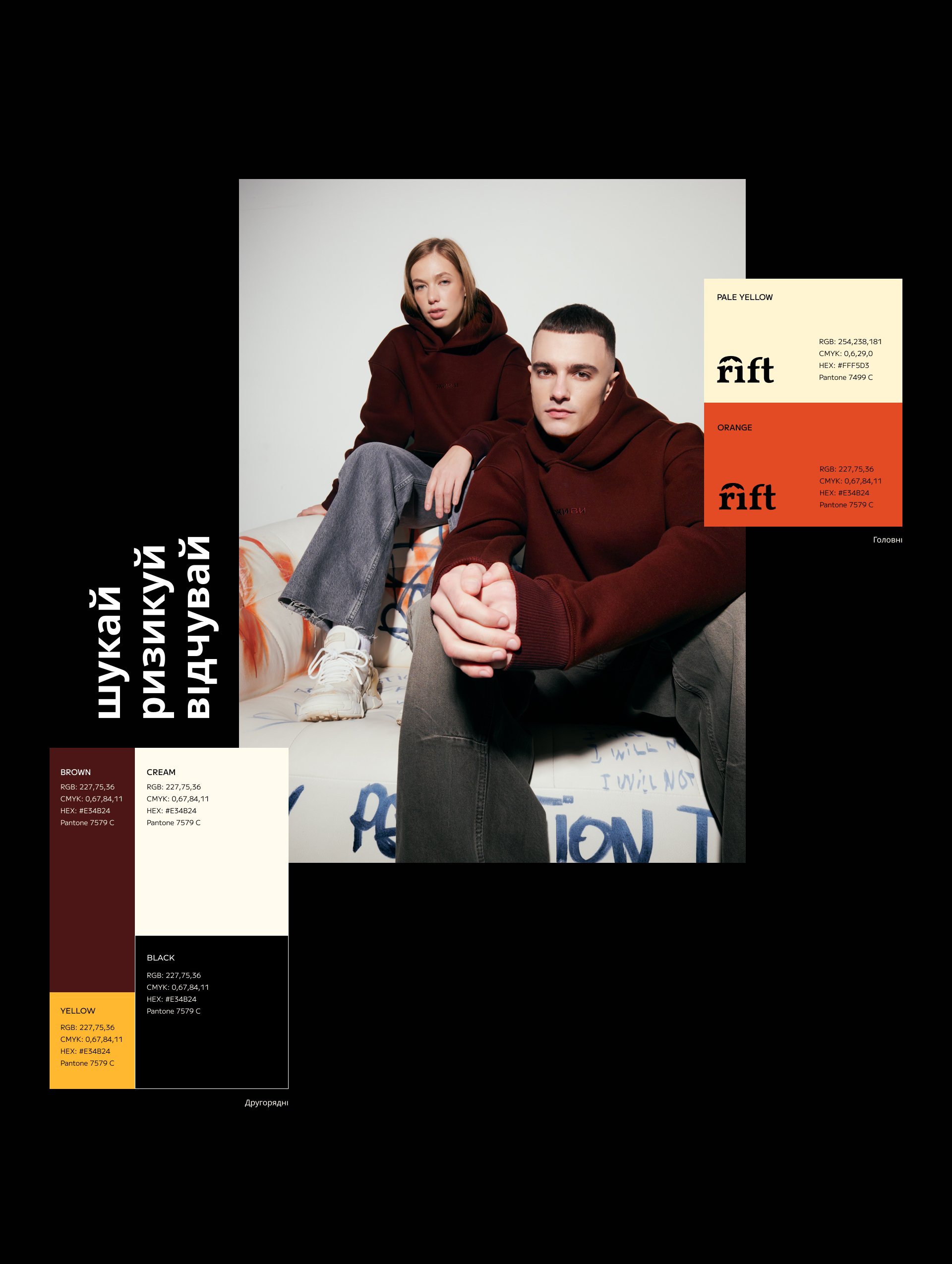
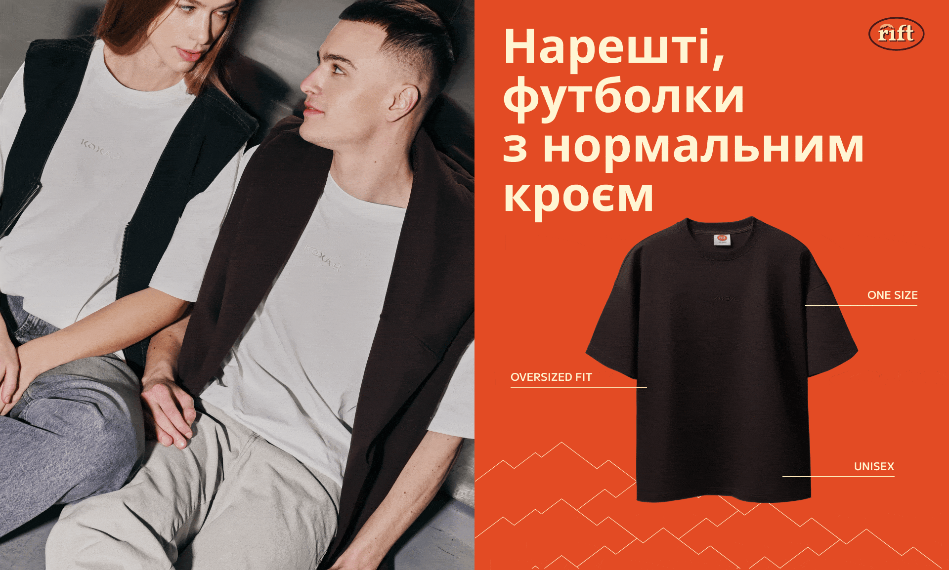
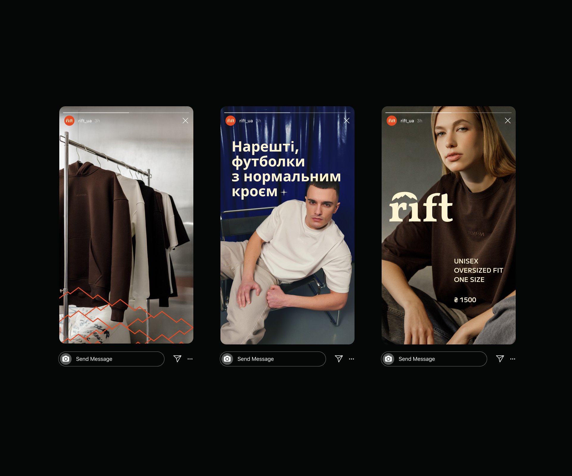
The audience includes climbers, tourists, and city dwellers looking for functional, stylish clothing for urban adventures. My task was to craft an identity reflecting the balance between nature and the urban landscape.
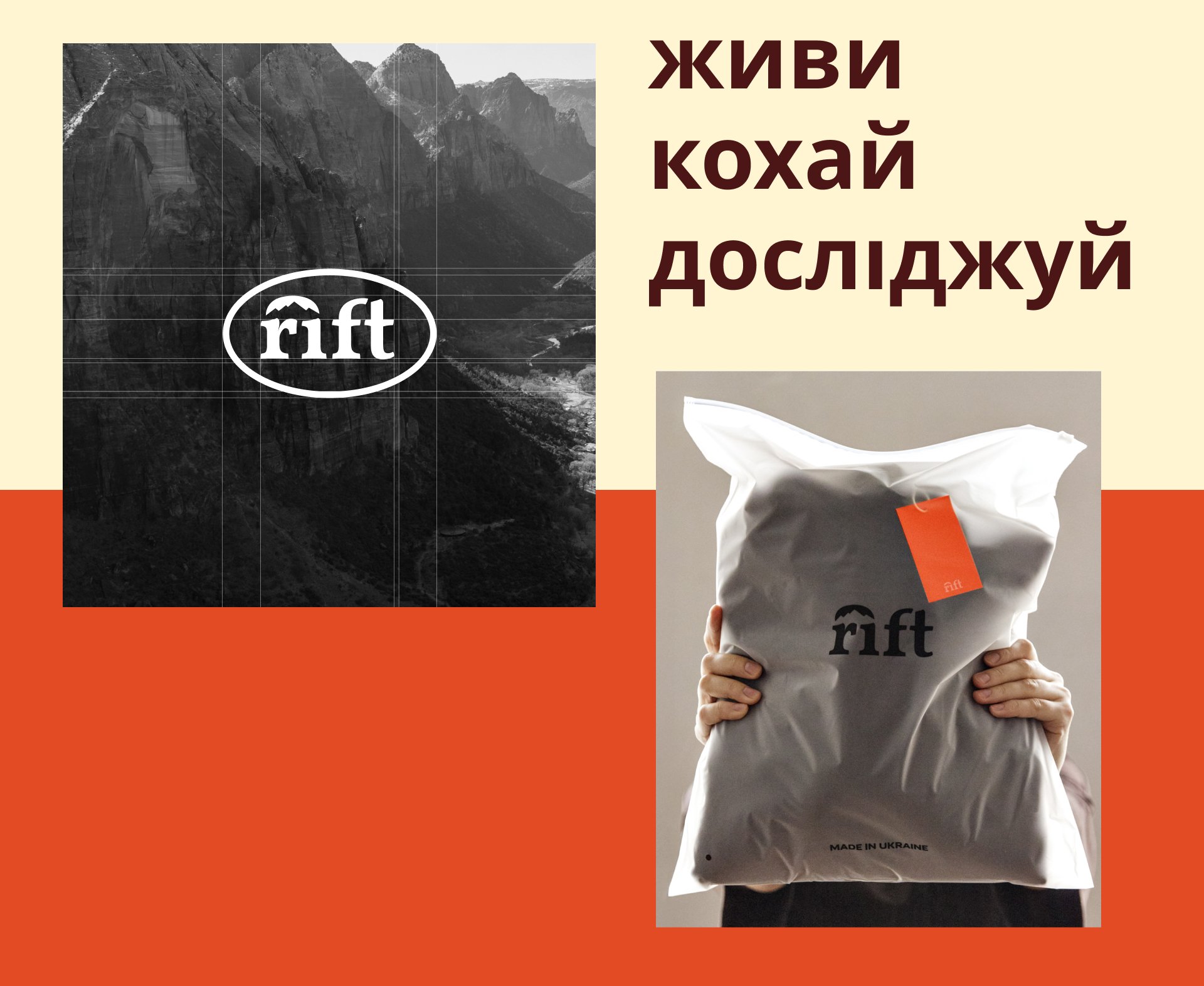
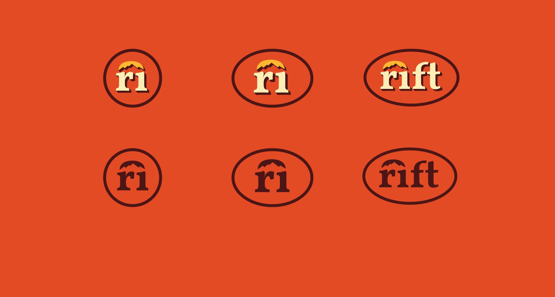
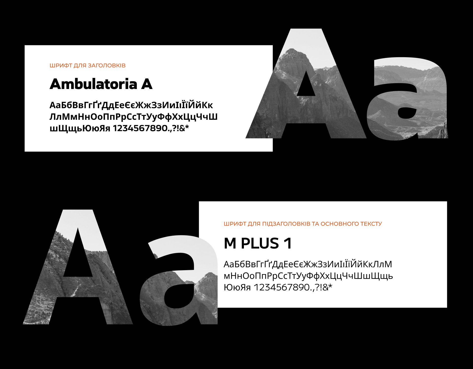
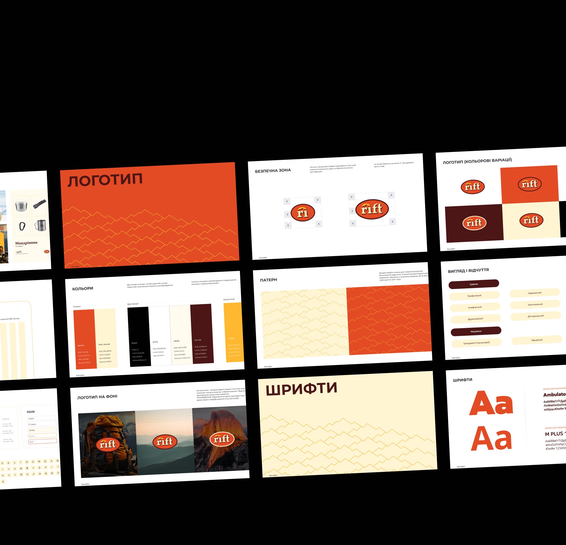
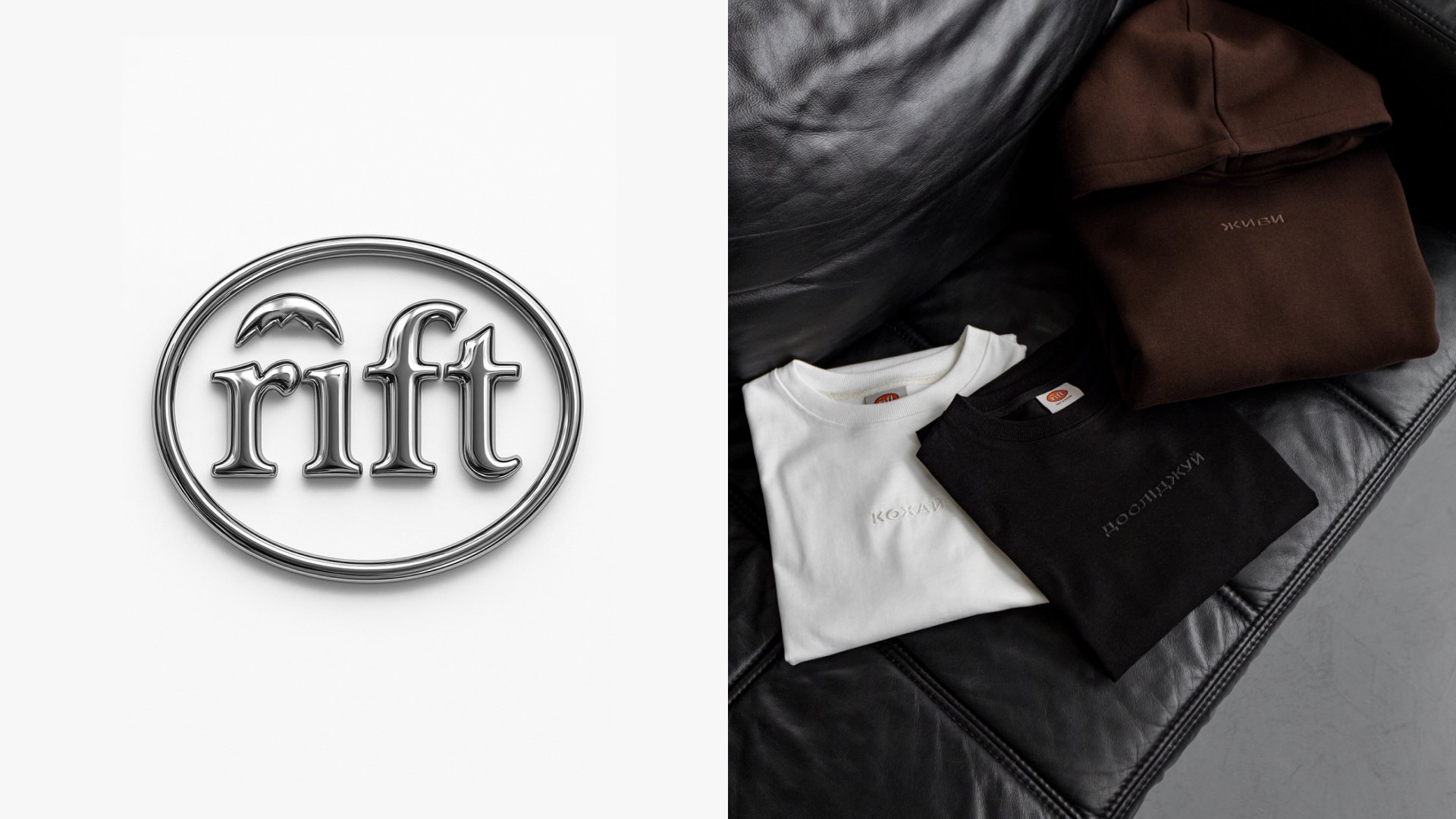
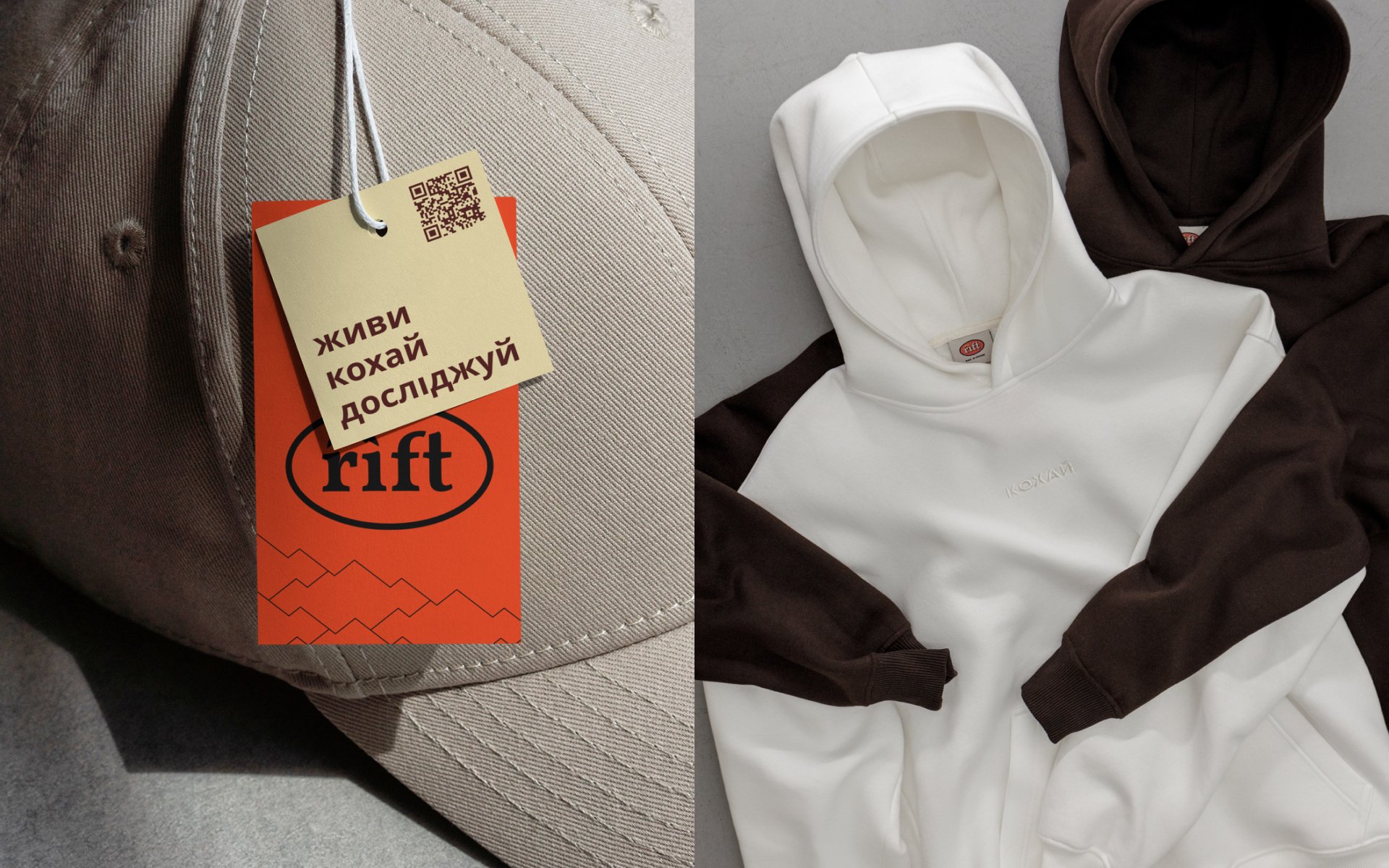
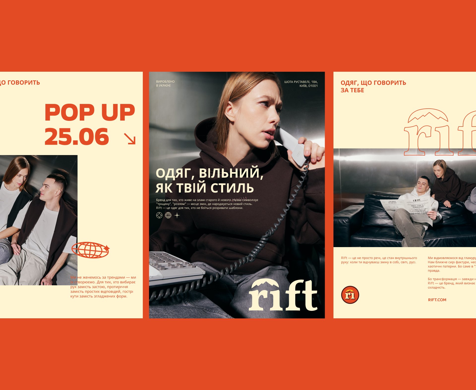
To make Rift memorable, I focused on designing a timeless logo. I chose a font with clean lines and smooth curves, adding volume to give it a sense of experience, as if “having been through many expeditions.”
Inspired by the name, I used the geological concept of a “rift” — a crack in the earth's crust that creates new landscapes — as the foundation for the logo.
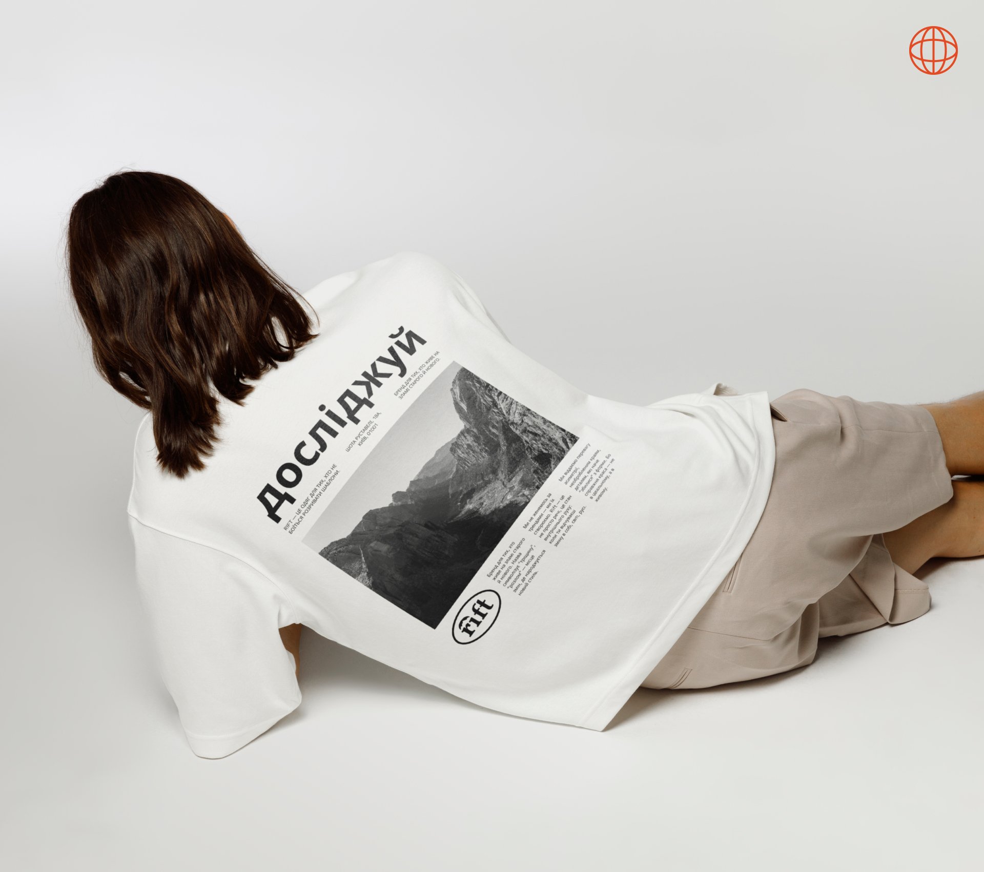
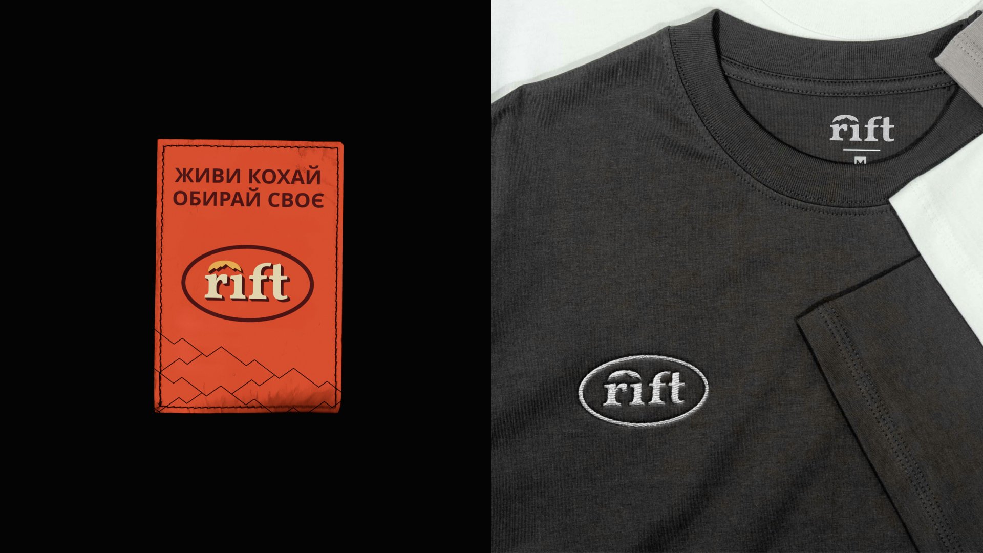
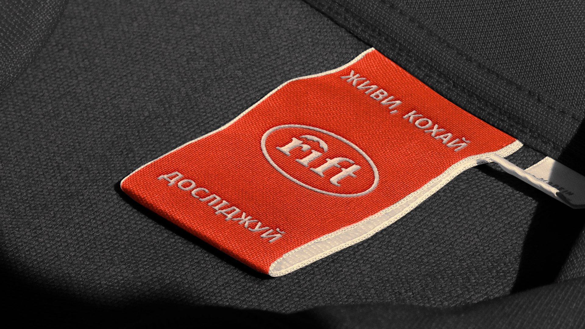
“Rift” represents change and challenges that lead to growth. To reflect this, I incorporated three key elements: a sunrise, mountain slopes, and a rift in the landscape. The mountain symbol above the letter “r” is a distinct feature, evoking height and challenges.
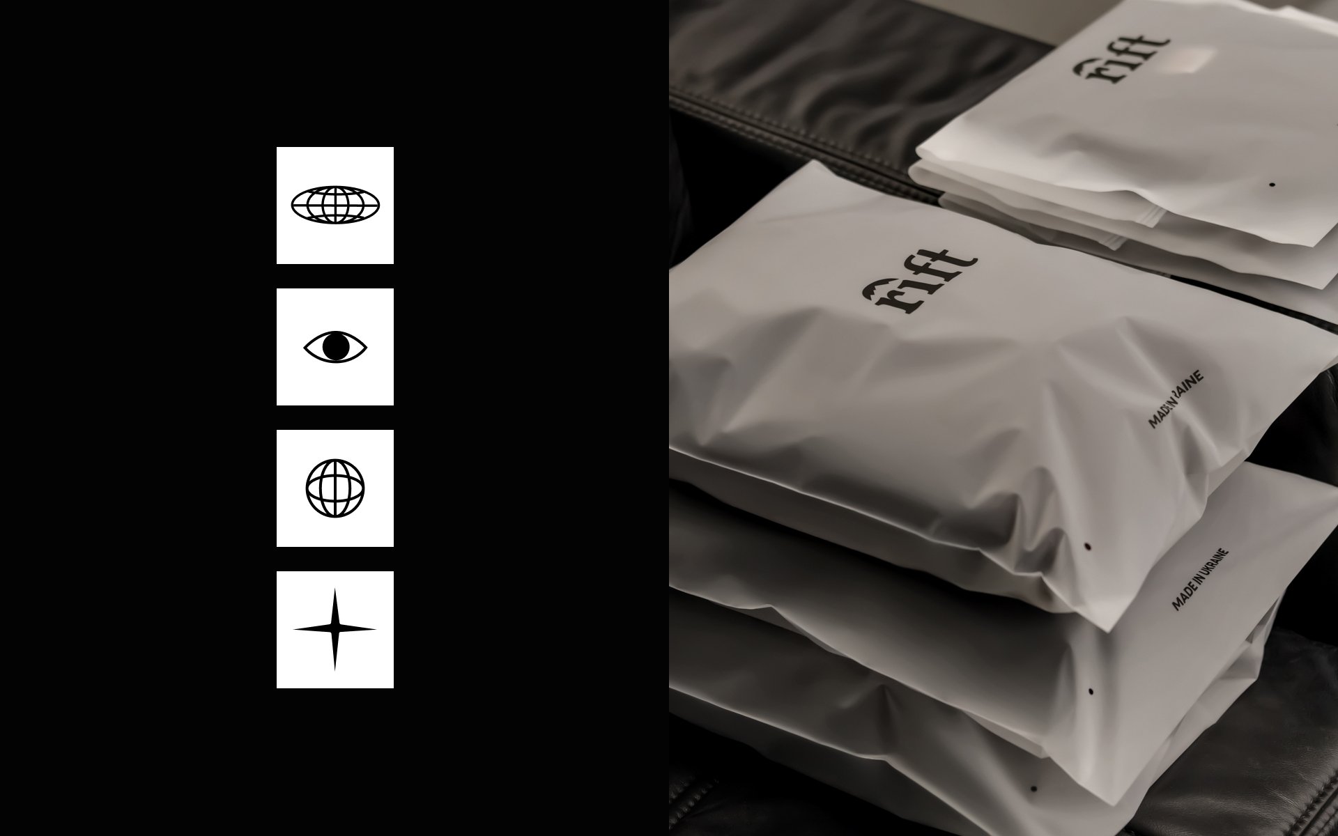
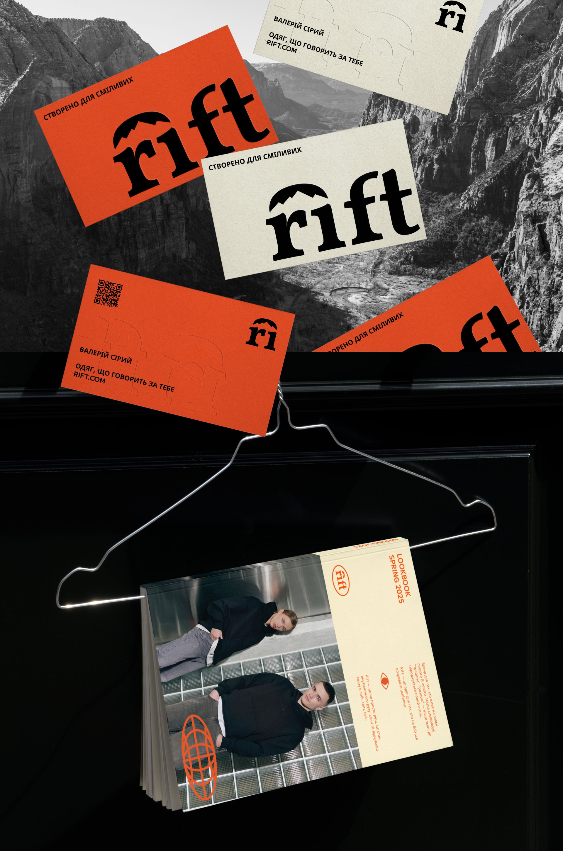
The visual style is adaptable to any format, from clothing patches to large banners, and has been compiled into a comprehensive brand guideline for consistent use.
Rift believes true adventure starts where the ordinary ends. The identity inspires people to step outside their comfort zones, seek new challenges, and discover new horizons, whether in the wilderness or the city.